Ready to Grow
OVERVIEW
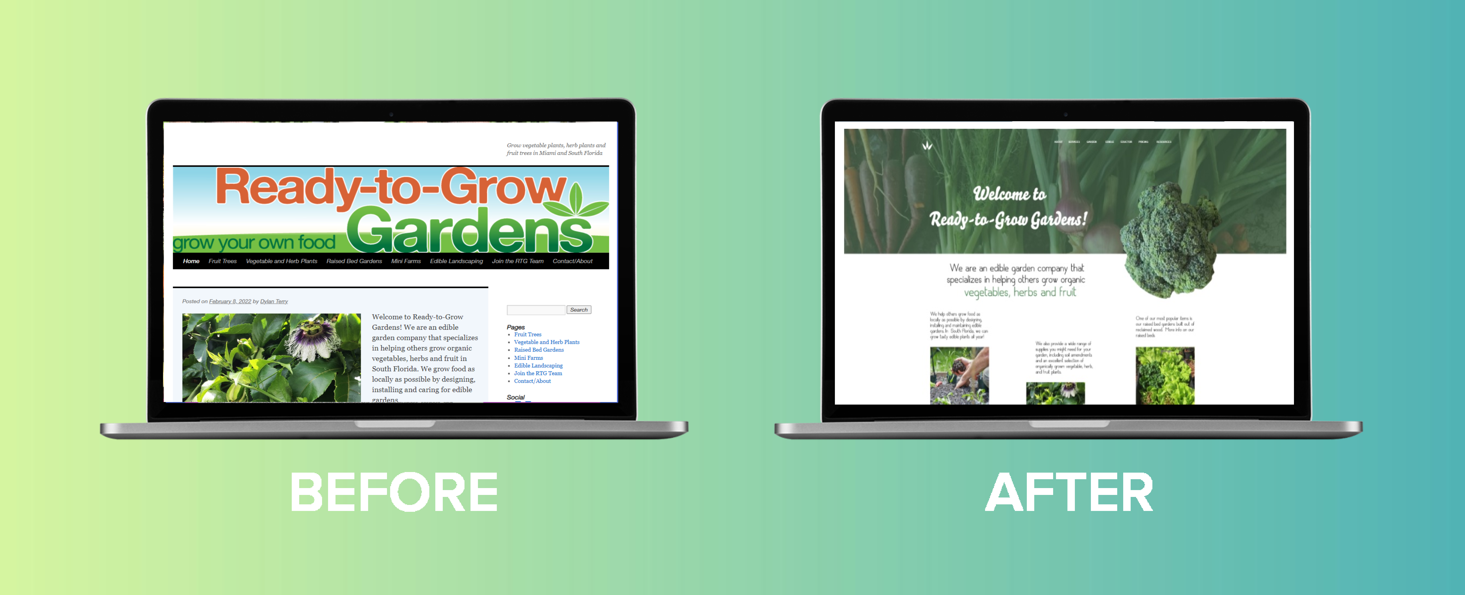
This case study showcases the transformation of the Ready-to-Grow Garden webpage, highlighting the significant improvements made to elevate user experience and drive conversions. The objective was to revamp the webpage design, streamline content, and optimize functionality to effectively communicate the brand’s value proposition and encourage customer engagement. Through careful analysis, strategic revisions, and user-centric design, the Ready-to-Grow Garden webpage underwent a remarkable before and after transformation.

PROJECT INFORMATION
Date: Sep, 2018
DELIVERABLE: Info Architerture, Wireframes, Prototype
SKILLS: AdobeXD/ Invision/ Adobe Photoshop/ Design Principle/ Word Press
CATEGORY: UX/UI
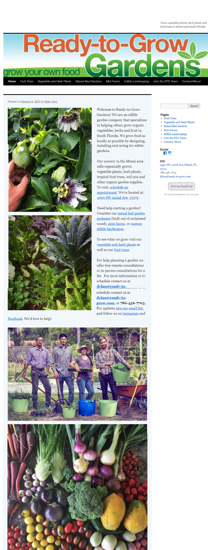
Before Revision
The initial version of the Ready-to-Grow Garden webpage faced several challenges that hindered its effectiveness. The layout was cluttered and disorganized, overwhelming visitors and making it difficult for them to find the desired information. The content lacked clarity, with lengthy paragraphs and jargon that failed to resonate with the target audience. Navigation was cumbersome, with multiple submenus and confusing links that hindered user exploration. Overall, the webpage failed to effectively showcase the unique benefits of Ready-to-Grow Garden products and capture visitors’ attention.

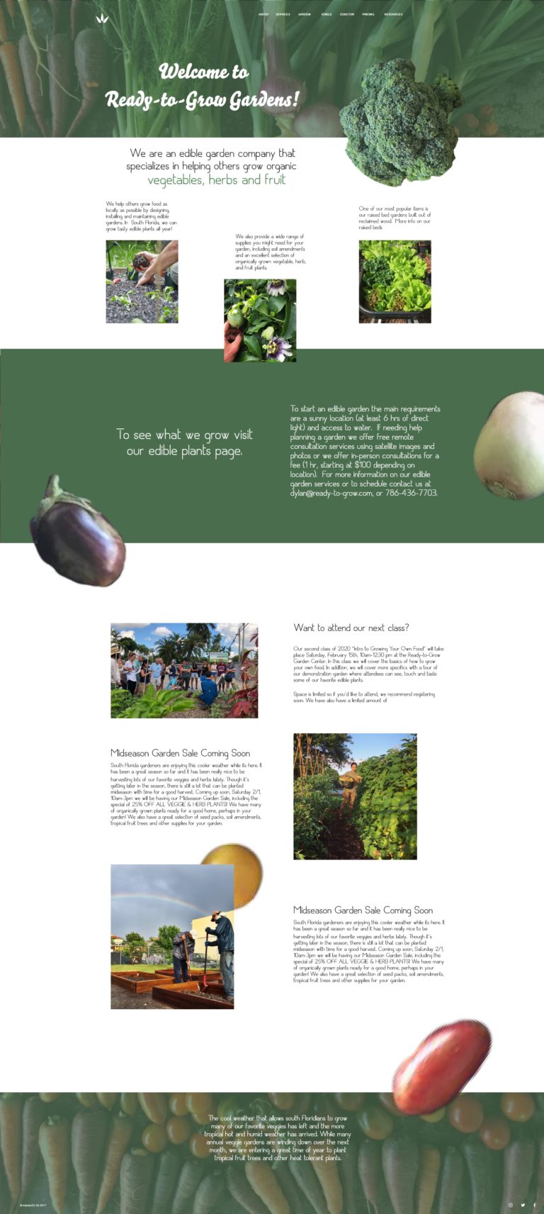
After Revision
A comprehensive revision strategy was implemented to enhance the Ready-to-Grow Garden webpage. The layout underwent a complete overhaul, adopting a clean and modern design. Visual elements were strategically placed to guide visitors’ attention and create an intuitive browsing experience. The content was revamped, adopting a concise and engaging writing style that communicated the brand’s value proposition clearly and succinctly. Key product features, benefits, and success stories were highlighted to build trust and credibility with potential customers.

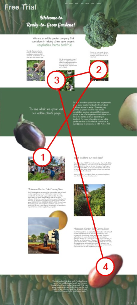
Real-Time Gaze Tracking
To gain valuable insights into user behavior and improve the webpage’s design, a gaze webcam was employed to track real-time data for the Ready-to-Grow Garden project. This advanced technology allowed for precise monitoring of users’ eye movements and gaze patterns as they interacted with the webpage. By capturing and analyzing this data, the design team could identify areas of focus, determine visual hierarchy, and optimize the placement of key elements for maximum engagement. Real-time gaze tracking provided invaluable insights into user attention and behavior, enabling iterative improvements to the webpage’s layout and content for a more intuitive and impactful user experience.

Conclusion
The revision of the Ready-to-Grow Garden webpage exemplifies the power of strategic design, content optimization, and user-centric approach in enhancing user experience and driving conversions. By addressing layout, content clarity, navigation, and mobile responsiveness, the webpage was transformed into an engaging and user-friendly platform. The revised webpage effectively communicates the brand’s value proposition, captures visitors’ attention, and encourages them to take desired actions. The successful transformation of the Ready-to-Grow Garden webpage now serves as a powerful marketing tool, fostering increased customer engagement and supporting business growth.
